Microsoft is working on a significant update to the OneDrive sync client for Windows, bringing the settings panel in line with the Windows 11 design language. The new design seems to be in testing with a handful of users, and it was first spotted by Twitter user @flobo09, who shared screenshots of the new UI.
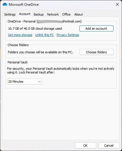
The differences in design are major and should be obvious at first sight. The tabs at the top of the window make way for sections on the left side of it, with each section also having an icon to make it easier to identify. These sections are also significantly different from the version that’s currently available to the general public. There’s no longer a “General” tab, with its old settings split into different pages. The default page is Sync and backup, which lets you set whether you want to back up important folders, as well as other settings related to OneDrive syncing. This includes the Settings from the old Backup tab as well as some of the General tab. Another big chunk of the General tab has been moved to the new Notifications section on the left-side menu.


The Account tab keeps the same settings it had before, just now with a more modern look. One of the big changes is that the information about your available cloud storage is now persistent across screens, so you don’t actually have to switch to the Account tab to see it.


The last big change is that the Network tab seems to be gone. This page allowed you to change the network bandwidth OneDrive can use for uploads and downloads. Also gone is the Office tab, which contained settings related to syncing Microsoft Office files opened by the Office apps themselves. It’s possible that these settings can be found in the Sync & Backup page, as there is a link labeled Advanced settings. Unfortunately, we haven’t been able to test this for ourselves and the screenshots shared don’t include this page.
Currently, it’s unclear who can try the new UI for the OneDrive sync client settings on Windows. You can technically download the latest internal version of the sync client, but the new UI isn’t enabled for everyone. It could be part of an A/B test, which is something Microsoft tends to do very often. Still, it’s clearly being worked on, and it should only be a matter of time until it’s available to the public.
Source: @flobo09 (Twitter)
The post The OneDrive sync client for Windows 11 could be getting a redesigned settings page appeared first on XDA.
from XDA https://ift.tt/2KE9NV1
via IFTTT

Aucun commentaire:
Enregistrer un commentaire